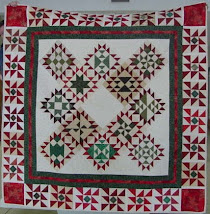
Remember how a week or so ago I shared that my hometown newspaper in KY is going to do a little write up about my Crayola Quilt Challenge Raffle Quilt and how it's one of 30+ quilts being given away to help raise money for Ronald McDonald House Charity...
Well they emailed saying they need a photo of me with the quilt - so Sunday night I summonsed David into helping me with that task after we got the kids in bed. He grabbed the camera and met me in the sewing/guest bedroom.
He really liked these two of me holding up the quilt... but look at that Blaaaah white wall behind me. :/ and he insisted folding up the bottom so that it showed..? but I'm not liking it.
So after about half-a-dozen snaps & clicks, David was DONE. :/ and nothing he had taken did I like. So after he left I played around some with the pillows and a Rubbermaid tote...
I pulled out a drawer and a stack of paper plates... perfect spot for my camera - now let's see if I can remember how to set the self timer.
Ta-Da!
PHOTO 1
Humm... not bad for the first shot. Love how the lighting is hitting the quilt to show up the beautiful quilting... but hate that shirt on me in front of it.. and also how I'm sitting. :/
PHOTO 2
So I do a quick shirt change to black... but some of the quilt is droopy behind me.
PHOTO 3
PHOTO 4
PHOTO 5
ok, so those last few are better of me but they don't really show off the beautiful quilting! TOO Bad David gave up on helping me before I thought of this - he could have been there to adjust the quilt when it kept sliding down...
I'm assuming they will also include a photo of the whole quilt top by it's self too...?
Please comment telling me if you like
Photo 1
Photo 2
Photo 3
Photo 4
Photo 5
I need to decide soon and email CKNJ back.... thanks for your help!
Love from Texas!









I actually like photo 1 the best
ReplyDeleteI like the second one because it shows more of the quilt. But the ones of you are really cute!
ReplyDelete-Sara
I like 3 or 4 of you.
ReplyDeleteSonja
I like the first photo because it shows more of the quilt. I think that most newpaper readers are not quilters and would like to see the whole quilt design, colors etc. Maybe you can show all the pictures to the newspaper and let them pick the one that they think will show best in the paper.
ReplyDeleteSusan Rizzi
quilttrack47@yahoo.com
#5 ... congrats.
ReplyDeleteI like 3 and 5 best.
ReplyDeleteI think you look adorable in all of the pics. If I had to choose I would pick #2 or #3.
ReplyDeletePicture number 4...you and the quilt look great!
ReplyDeleteNumber 1 shows off the quilt beautifully, 3-4 are so nice of you. I think I would send several and let the newspaper choose :)
ReplyDeleteKentucky_Sunshine
First, your quilt is GORGEOUS!!!
ReplyDeleteThe pictures with your black top look nice and the quilt looks good too but the top blends a bit with the quilt. Photo 1 really does show off the quilt and your expression makes it look like you are just tickled pink to have quilting a part of your life.